


Boring Atlas
Project Type
Desktop App
Role
Lead UX Designer
(9 Months)
Services Provided
Interaction Design
Wireframing
Branding
Tools Used


-
Designed the interface for an interactive visual timeline (3000 BC–present) as a dynamic and accessible learning tool for world history.
-
Led rapid prototyping, balancing app functionality and development constraints through iteration of high-fidelity mockups.
-
Conceived visual assets for the app’s key historical categories, making complex information more accessible and engaging for users.

The Problem
Learning history should feel like exciting adventure, but traditional tools make it feel like a chore.
Between expensive, outdated textbooks and dense, text-heavy Wikipedia articles, learners face too much friction to stay engaged, and educators have too few alternatives to mention.
People aren't bored by history—they are bored by the experience. In order for the experience to improve, we have to offer a radically different solution.

The Foundation
Our baseline was this rapid low-fidelity wireframe sketched by one of my engineering teammates.

From this template, I established three core UX pillars to guide the visual and interaction design:
Modern
Moving away from static, text-heavy pages by implementing contemporary UI patterns and a clean, dark-mode aesthetic.
Intuitive
Establishing a design system that prioritized how lengthy information was presented to users.
Interactive
Shifting the user from a passive reader to an active explorer with the opportunity to take part in the learning experience.
How might we reinvent the traditional historical learning model in an immersive experience that makes extensive information easily digestible and fun to navigate?

Core Features

The centerpiece of Boring Atlas is the Interactive 3D globe.
Instead of traditional, static maps, users can spin this element with the click of a mouse to locate various events. However, the neat part is that this isn't the only way to control it.
To prevent users from getting lost in time, we designed other ways to navigate. One of these is the Time Slider, made for macro-navigation.
Located at the bottom of the interface, this slider can be operated via a marker, allowing users to quickly jump across broad eras and centuries.


On the left-hand side of the screen, the vertical timeline provides a zoomed-in view with specific events based on the year set in the Time Slider.

Putting it all together...
These individual components operate in concert with one another to drive user discovery & engagement.
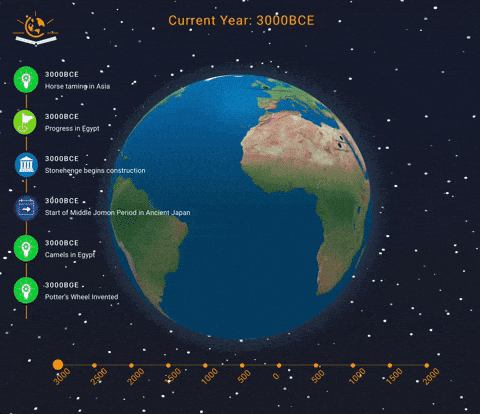
When an event on the left-hand timeline is clicked, the globe will navigate to the icon's location on the map, according to the time slider's date —such as navigating to Japan to highlight the end of an era, or zooming into Egypt to show when the Pyramids of Giza began construction.
Selecting an event triggers a clean, contextual side-panel on the right. This popup delivers digestible summaries of the event (e.g., details on Alexander the Great in the Mediterranean) alongside helpful external links for deeper research, keeping the user engaged without pulling them out of the experience.


Challenges & Solutions
1. Navigating 5,000 Years of History without inducing fatigue or cognitive overload
Organizing everything into a colossal, singular timeline would be frustrating for potential users to browse. Not only would they be subject to scrolling through endless entries of content, but they would find it difficult to mark specific events. Users needed a way to accomplish both tasks with zero difficulty.
We devised a couple of features to aid with navigation and information retention. The first is our dual-axis navigation system consisting of the horizontal Time-Slider for rapid scrolling, and the vertical timeline for precise event selection. With this approach, we kill two birds with one stone.
SOLUTION
The next involved my design of categorical "Marker" icons for the timeline, with unique indicators for each category, such as construction of monuments, the signing of documents, and the end of kingdoms, and starts of wars. The work done with these icons took our humble app to newer creative heights.


2. Designing Around the 3D globe element without obstructing it with informational clutter.
Traditional web layouts or modal windows would hide the app's centerpiece, and completely break the immersion of the experience.
SOLUTION
I anchored all UI components (timeline, sliders, and info panels) to the perimeters of the screen, ensuring the globe remains an unobstructed focus at all times.

3. Translating ambitious UI concepts into a functional product within time & technical constraints.
Because this was my first time working cross-functionally, I needed to ensure my designs offered high visual impact without demanding any extra commitments for my fellow engineers, such as an overhaul of the architecture.
SOLUTION
Sticking to my team's original wireframe, I focused on simple, high-impact enhancements that the developers could easily implement, like the info panels, and marker icons. My fellow engineers would successfully implement all my design additions into the final prototype.

Scope & Milestones
Given that we had nine months to complete and present Boring Atlas, we initially planned an ambitious scope, aiming to have a prototype ready months before the deadline.
As we began the development phase, however, we made necessary adjustments and additions that shaped the final product, such as the contextual info tabs and categorical markers. In the end, here is how our project roadmap unfolded:


Retrospective
As the app's lead visual designer, my goals were to create an interface that was not only user-friendly and highly interactive, but one allowing for the cultivation of knowledge.
After nine months of iteration, we presented Boring Atlas to fantasic audience reception, proudly meeting and exceeding our original goals for this project.
If we were ever to return to Boring Atlas for another development cycle, here are some updates I would want to implement:
USER RESEARCH & TESTING
Because this was an early, engineer-driven build, we lacked formal user research.
I would start
again and conduct user interviews with students & educators, and usability testing to validate future updates.
CROSS-PLATFORM EXPANSION
Since Boring Atlas was made primarily for desktop, it would be great to take it further with a mobile app on Android and exploring that side of development.
INCREASED
IMMERSION
Testing micro-interactions and audio ques, taking user immersion a step further.
I’ll always regard this project as an important stepping stone for me. It was not only my first team project as a UX Designer, but the first to that taught me how designers and developers work in tandem to take a product from 0 to 1 .
Seeing my team not only receptive but eager to implement my ideas was deeply rewarding. and my experience here helped focus me to a career where I possess strengths of a designer and developer.